Haven’t spoken much on building just your basic website in a while and I thought I’d share a few quick and easy tips on what you can do for next to nothing.
Went out on www.mineeds.com and found myself someone looking for a new website – and I have to be honest the prices being quoted to this guy were pretty off the wall. Granted, he wanted a shopping cart with a 50,000 song catalog… but I have to say $4,500 is a pretty steep bid (since the shopping cart does most of the heavy lifting and he’s already picked one out).
Had to ask myself – if I were starting a business could I really afford that? Probably not. What I’d be 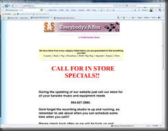 looking for is something a bit cheaper… like FREE. Now most people don’t have the ability to do free – but many web builders can work a lot on prices to help small businesses by using a free template, a bit of ingenuity and a decent eye.
Here – on the left is what our guy started with. Which… is pretty barren, and looks a bit retro-web 1990. They want obviously a very upbeat pro-site – and those are not cheap. But I figured I’d see what I could do with FREE just for fun.
(BTW – definitely check out the site here in a bit when the catalog is up sounds like they have got some good stuff there.)
I went to a number of free template sites – and finally found one or two that actually were free. (Which is rare these days it seems – but that’s another rant for another day.)
Now, after some perusing I selected two free templates in PSD format that didn’t look half bad for 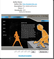 something that said “Youth, Fun, Hot, Music” to me. The author is listed as http://www.free-templates-download.com/?id=25 and you can get this one there. It’s not bad – there’s a kind of music DJ flavor and it’s a clean tech design – menu on the left – company name at the top – and we can use this page to replicate all the other pages we need. All in all it’s not a bad choice.
Which is what you want to look for in templates – something that you can replicate for each of the pages, that allows room for catalogs and shopping carts in the center where it catches the eye – and with a nice big logo to get you that branding that every business needs.
It is however … for all it’s hip attempts… about as bland as vanilla ice cream 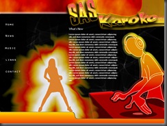 with the cold blues solid colors and grays and and sharp edges and we need to change that. We need hotter – we need louder – and we need something that says using the site will make you cool. So for that we need to do a bit of Emmeril on it and do a Salsa BAM!! to it…. when we do… we get the page on the left here.
Really all we did was bring it into Photoshop, do a bit of playing with the color overlays, give them a nice readable logo… and suddenly we have something cooking there. Duplicate a few of the image layers – give them a standard gradient overlay, set that to a color burn. Do a corona flare on the girl – a bit of beveling to a layer with the DJ… and we have a bit of a smoking site design from nothing that cost us nothing. (Which… I would recommend that everyone read the “nothing” and “free” carefully these days. Just grabbing a template does not make you the owner necessarily. ALWAYS read the fine print!)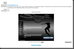
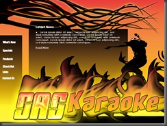
Now… off the same website I found… this design which is very very dark skateboarder. But… for some reason I saw something different. I saw not the dark moody gray and black but a very fluid motion between the skateboarder and the tendrils above him that said, “Hey this catches an eye” but it needs to say “HOTTER” and “LOUDER”. Which in some ways … is a shame because it’s such a nice simple design. So … I did my best to make it loud and fun.
And this is what I got. I got flowing glowing tendrils of the night and flames coming off a glowing logo as a raving dancer dives into the heat of a party.
Okay… that’s the schpeil I’d use to sell it – but the truth is the same design as above with a bit of “BAM” and you’ve got something recycled into a very cool look. All of which – is essentially free, just takes a bit of elbow grease to unlock the look into something very unique. Which is important.
Just grabbing a free template which has a decent design for a small business isn’t enough. If the design is even half way good someone else has it. You need to take it and make it your own. How? Simple. Do what I did. Don’t look at the design from “What can I make out of this?” but “What can I make this INTO?” – basically what can I create from this that isn’t there. Well – I figured music – I figured party – I figured South Beach – hot nights, good times, and smoking good toons. Thats what they need.
The catalog is the easy part. It’s just something displayed on a page. The hard part is knowing what the page needs to say or do or look like to really sell. It’s the difference between the 1990’s retro-web page with the simple text and links … and really hot links that sell items.
